Brown Eyes – George Clausen

Brown Eyes 1891 Sir George Clausen 1852-1944 Presented by C.N. Luxmoore 1929 http://www.tate.org.uk/art/work/N04484
George Clausen, Brown Eyes (1891) oil on canvas

One of the artists to catch my attention during my recent visit to Tate Britain was George Clausen (1852-1944), an English painter, who was born in London, and was the son of a decorative artist. He studied design in South Kensington from 1867 to 1873 and later went on to Paris to study under two rather traditional artists, William-Adolphe Bouguereau and Tony Robert-Fleury. Despite their conservative approach, Clausen would have learnt from them the importance of technical skills. However, while in Paris it was perhaps inevitable at the time that he would also come under the influence of the impressionists who completely rejected the academic style propounded by Clausen’s teachers.

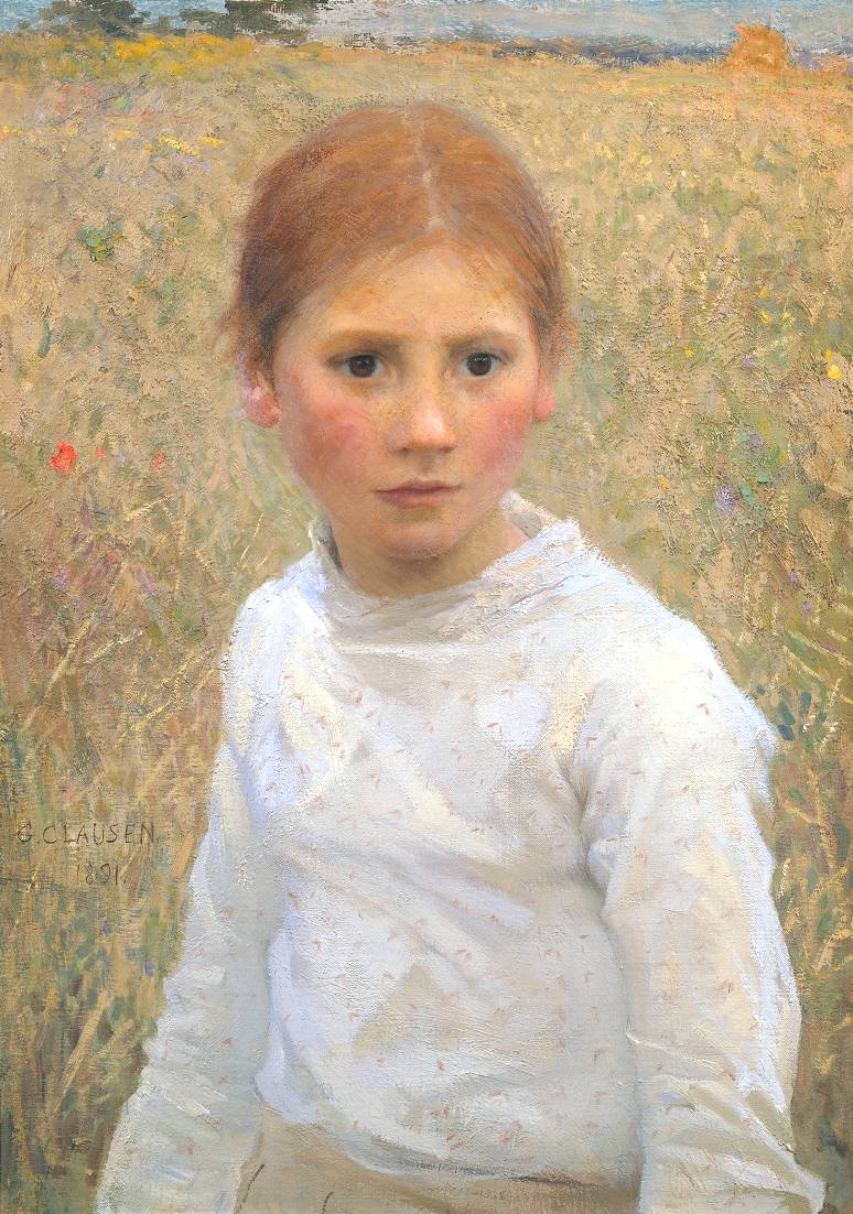
George Clausen’s paintings concentrated on peasant figures and landscapes, though, as with the French impressionists, his real concern came to be the rendering of light in open air settings or in the shady shelter of a barn or stable. His portrait of a young peasant girl, entitled Brown Eyes, painted in oils on canvas in 1891, is an absolute delight. On the one hand it presents a perfect classical triangular composition, in which the girl’s white blouse dominates: however, the girl’s intense expression adds real depth and energy, and one wonders what has caught her attention as she looks out from the canvas over the shoulder of the observer. The field in the background provides a beautiful natural contrast, delicately captured with fine brushstrokes. So don’t delay, get down to Tate Britain and see for yourself the magic of this portrait, which is just one of the many treasures held in the permanent collection.


One final observation, although it is always well-attended, possibly because of its location in Pimlico, Tate Britain is not swamped by crowds in the way that other galleries can be. So if you’re looking for a leisurely, unstressed Sunday afternoon but want to appreciate some true artistic masterpieces, I can highly recommend the venue.


Jeremy Moon – Call that art?

Untitled [8/71] 1971 Jeremy Moon 1934-1973 Purchased 2006 http://www.tate.org.uk/art/work/T12243
Jeremy Moon Untitled [8/71] (1971) acrylic on canvas

When you walk into Tate Britain you are given a choice as to which rooms you visit. There are hundreds of representational paintings in which the subject of the composition is immediately obvious, a portrait or a landscape, for example, where the artist has attempted to render a likeness, pretty much like our ancestors sought to render the likeness of antelopes and bison and human figures carrying spears on the walls of the cave in Altamira.

So what on earth was Jeremy Moon trying to render when he produced “Untitled [8/71]”? The answer is simple. He was rendering a visual format we are all so familiar with: a grid. We’ve all seen grids a thousand times, probably see them everyday and we take them for granted. Timetables are laid out in grids, many gardens have trellises and if they are lucky will have English roses growing up the trellis making a wonderful combination of geometric and non-geometric forms. Chess boards and so many other board games are based around grids. So in a sense, even Moon’s non-representational paintings actually represent something. The fact that he does not title many of his works, however, indicates that he does not wish to give the observer any preconceptions over and above what is obvious in the paintings, no verbal stimulus that would in some way limit the observer’s perception.

But anyone could paint this, you might say. To which I would retort, “Okay, if you say so. Go ahead and try. And if you really think it’s child play, get a child to reproduce it.” The fact is that tremendous technical skill is required to produce a work such as “Untitled [8/71]”. Perhaps what is disconcerting is that the palette is very restricted, unlike a Cézanne or a Dutch master. The plastic arts can suffer from the same prejudices that affect classical music. If individuals are brought up on a lazy, limited diet to believe that all classical music has to sound like Beethoven, all opera like Verdi, then it can be difficult to appreciate the avant-garde composers. The problem here is not one of ignorance but of education. Real education is essentially about getting human beings to think and feel for themselves so that they trust their consciousness and their emotions. The patina of knowledge acquired in the educational process is just that, a patina: knowledge is not the same as thinking and feeling. Art is the expression of thought and feeling, consciousness applied to an expressive medium. What thoughts or feelings does a portrait, so well executed that it looks like a photograph, stimulate in the observer? Or, why did artists down the years stop painting antelopes or bison on their living room walls? Not that I’m knocking representational painting. If anything, what I find disturbing is how conventional schooling so often fails to provide young people with sufficient opportunity to explore the arts. Hobbyhorse again! “Get down,” says uncle Toby.


Born in 1934, Jeremy Moon was killed in a motorcycle accident in 1973. There is a website dedicated to his work where you can see many of his beautiful paintings http://www.jeremymoon.com/. However, my recommendation is, get along to Tate Britain in Pimlico as soon as you can and see the work in the original.


Missing out. . .

A Bigger Splash 1967 David Hockney born 1937 Purchased 1981 http://www.tate.org.uk/art/work/T03254
David Hockney, A Bigger Splash (1967), acrylic on canvas. Click to enlarge.

I have chosen David Hockney’s painting, A Bigger Splash (1967) from the Tate Britain collection, to accompany a new poem by Molly Rosenberg. The connection is perhaps rather tenuous, but both the poem and the painting deal with absence.

In Molly’s sensitive poem, a personal loss is registered and there is a tense equilibrium between the absence of one life and the presence of another. Hockney’s composition, however, captures the sad, dreary perfection of a Californian day by the pool. Here the pastel colours are deliberately drained of life, and the hard geometrical edges of the draughtsmanship are used to highlight the lifelessness of the scene. What is missing from this painting is the richness of life, there is no hint of a body anywhere. The splash that occurs is tantamount to an attack on the vapid soullessness of the scene, an act not of vandalism but of defiance and rebellion, a yearning for life.


Missing out

Glint of shining Aqua
At times almost blinding.
A boy figure stands
At the edge of the pool.
Elongated limbs that will stretch
With the promise of years to come.
The grandchild he so longed for, yet never saw.
Impatient, he left before age could claim him.

Corn-coloured hair ruffled beneath the surface
Drifts like weeds on the riverbed.
Honeyed limbs, silky smooth
Bejewelled with crystal drops.
He’d have held your small soft hand in his.
Delighted as you tightly clasped
your arms around his neck.

Molly Rosenberg

Edward Middleditch – Crowd, Earls Court (1953)

The English artist, Edward Middleditch (1923–1987), was a painter, draughtsman and printmaker and one-time Keeper of the Royal Academy. Despite initially being a conscientious objector at the outbreak of World War II, he did eventually see active service in France and Germany with the Middlesex Regiment; he was wounded and also received the Military Cross

crowd
Crowd, Earls Court, 1953 (oil on board)

Middleditch took his motifs from the natural world: grasses, water, feathers, opening petals, reflections, and in particular he sought to capture the way observed patterns in water currents and light gradually shift.

This preoccupation can be seen marvellously in his canvas Crowd, Earls Court (oil on board, circa 1953). In this study, what captures the eye initially are the swirling patterns of light on the pavement in the foreground. The human subject, relegated to the second plane, is a tightly packed crowd that appears to be trying to flee from the canvas. Beyond the crowd, to the left, there is a burst of light that emanates from an unseen source behind the wall. The entire energy of the painting travels up from the pavement, up towards the crowd and beyond, as though the crowd is being swept along by the power of the light. The clothes worn by the figures in the crowd, although indistinct, suggest something Biblical, and one wonders whether the explosion of light that appears to be attracting them may not be a Messianic figure.

The subdued use of colour further enhances the power of the draughtsmanship in this composition that I found to be truly mesmerizing. I’m sure that once you have seen this richly suggestive painting for yourselves, at Tate Britain, Earls Court will never look quite the same.

Dorothea Tanning, A Mi-Voix 1958

A Mi-Voix 1958 Dorothea Tanning 1910-2012 Presented by William N. Copley 1959 http://www.tate.org.uk/art/work/T00298
Dorothea Tanning, À Mi-Voix (1958) oil on canvas

London has some of the finest publicly owned museums and art galleries in the world and it is all too easy to take them for granted or to dismiss them as mere tourist attractions. Access to these great institutions is currently free, and so it should be. These facilities are great learning resources for children and for adults. Art is an essential human activity and has probably been with us for as long as we have had language. The representation of consciousness, of feelings and ideas is fundamental to our sense of identity, whether it be in words or images. That we are complex beings is to be applauded: it is this complexity which generates great drama, great music, great poetry and great art. We are the only species in nature to ask questions about what we observe in the external world and what we endeavour to understand when we look introspectively into our hearts.

Traipsing round Tate Modern last Sunday, wet through to my soul, and disappointed that the Pollocks I had gone to see were not currently on display there, I needed a piece of art to raise my spirits, and I found several. In particular I was struck by the ethereal beauty of a painting by Dorothea Tanning, À mi-voix, a title which in English means ‘in a low voice’, almost a whisper. This beautifully executed canvas took my breath away, and there is so much that I could say about it, but I won’t go into detail. Suffice it to say that at its heart I see two figures, male and female, bound by a central spinal column, expressing a love that is so delicately intimate it need not be shouted from the rooftops. But maybe that’s just me! Don’t take my word for it, go and see for yourself.

DTbyInverarity
Dorothea Tanning

Artist and writer Dorothea Tanning was born in the United States in 1910 and trained as a painter in Chicago. She was associated with surrealism early in her career and she was married to fellow artist Max Ernst for thirty-four years until his death in 1976. Among her friends were Man Ray, George Balanchine, Truman Capote, Virgil Thompson, and Igor Stravinsky. Throughout her life she was always busy busy busy, into everything: painting, printmaking, sculpture, set and costume design, and her work was exhibited in the Guggenheim Museum, the Metropolitan Museum of Art, Tate Modern, and the Philadelphia Museum. In the late 1990s Dorothea turned to writing poetry and two of her poems are presented below. She also wrote an autobiography entitled Birthday (1986) and in 2004 published a novel Chasm: A Weekend. In an epigraph to one of her poetry books she quotes Montaigne : “it’s hard to be always the same person.” She died in 2012 at the age of 101.

For more information see http://www.dorotheatanning.org/life-and-work.php


All Hallows’ Eve

Be perfect, make it otherwise.
Yesterday is torn in shreds.
Lightning’s thousand sulfur eyes
Rip apart the breathing beds.
Hear bones crack and pulverize.
Doom creeps in on rubber treads.
Countless overwrought housewives,
Minds unraveling like threads,
Try lipstick shades to tranquilize
Fears of age and general dreads.
Sit tight, be perfect, swat the spies,
Don’t take faucets for fountainheads.
Drink tasty antidotes. Otherwise
You and the werewolf: newlyweds.

*

Sequestrienne 

Don’t look at me
for answers. Who am I but
a sobriquet,
a teeth-grinder,
grinder of color,
and vanishing point?

There was a time
of middle distance, unforgettable,
a sort of lace-cut
flame-green filament
to ravish my
skin-tight eyes.

I take that back—
it was forgettable but not
entirely if you
consider my
heavenly bodies . . .
I loved them so.

Heaven’s motes sift
to salt-white—paint is ground
to silence; and I,
I am bound, unquiet,
a shade of blue
in the studio.

If it isn’t too late
let me waste one day away
from my history.
Let me see without
looking inside
at broken glass.

Dorothea Tanning


Gustave Metzger – Homage to the Starving Poet

Homage to the Starving Poet, 1951 (oil on canvas)

Homage to the Starving Poet 1951 Gustav Metzger born 1926 Lent from a private collection 2015 http://www.tate.org.uk/art/work/L03660


Gustav Metzger was born in 1926 in Nuremberg. His parents were orthodox Jews, and nearly all his relatives were murdered by the Nazis during the Second World War. He was saved by the Refugee Children Movement in 1939 and brought to England. Twenty years later he gave his first individual exhibition entitled Three Paintings by G. Metzger in a London café. Metzger performed his famous Liquid Crystal Projections in the 1960s at concerts of the bands The Cream and The Move in London. His lectures inspired Pete Townshend to smash his guitar on stage. Yoko Ono is among his admirers.

Gustav_MetzgerA founder member of the Committee of 100, led by the philosopher Bertrand Russell, and which was dedicated to opposing nuclear war and weapons of mass destruction, Metzger took part in demonstrations and was on one occasion sent to prison in Staffordshire for one month. He has cited William Blake as a life-long influence on his art.

Although dedicated to ‘the starving poet’, the three disintegrating figures in Metzger’s deliberately sub-fusc triangular composition (reproduced above) were perhaps inspired by the Crucifixion scene in the Isenheim Altarpiece, painted by the German Renaissance painter, Matthias Grünewald (1470–1528).

I could be wrong, but why leave it to me? Why not head along to Tate Britain in Pimlico and see for yourself!

Blue Beads at Tate Britain

J. D. Fergusson, Blue Beads, Paris 1910 (oil on board)

Fergusson_Blue-Beads


J. D. Fergusson (1874–1961) was a Scottish landscape and figure painter and sculptor. Initially he entered Edinburgh University to study medicine but then decided to take up art. He was greatly influenced by the French painter, Manet, though this does not explain why he married a dancer, Margaret Morris: or maybe it does.

What fascinates me about this painting is the manner in which the artist has transformed the portrait of the woman into a landscape, with different sections of the figure being divided as though into different fields with different crops. Simultaneously, it has the effect of transforming the landscape into a female figure, thereby underlining the intimate relationship we all share with the land, the land that feeds us and which will welcome us back at the end of our lives.

Ashes to ashes, clay to clay: we are starlight and we are mineral earth, and we are the consciousness of creation. All of this Fergusson has rendered with the simplicity and the breathtaking beauty of his palette and brush strokes.

So much more could be said about the detail of this painting but sometimes less is more!


No photo can do justice to this marvellous work of art, so don’t delay. Hurry along to TATE BRITAIN in Pimlico at the earliest opportunity to see it for yourself! And yes, don’t ask, I’d love to have this masterpiece on my wall!


So is it a blog or a blag?

William Scott, Orange, Black and White Composition, 1953 (oil on canvas)

OBW_Scott

Bit of both, really. See I’m no art expert, have no training in the field and know little more than the next man or woman. But I use my eyes and I like to look. So what do my eyes tell me about William Scott’s Orange, Black and White Composition which hangs in the Tate Britain gallery in Pimlico? Well, loads. Firstly there are no squiggles, it’s all straight lines, all geometric but in a haphazard way: the square angles are not perfect 90 degrees and the lines are not drawn with a ruler. As there is nothing curved, nothing circular, the initial impression is one of hardness rather than softness.

And what about the restricted palette, just three colours? What does the lack of bright colours, the lack of pastels, for example, what does that tell us? In fact the colours are all muddy, earthy, iron and coal sort of colours.

Do we have to like a painting in order to appreciate it? I think not. We can find it interesting; we can enter into a dialogue with it, but not necessarily find it beautiful. However, it may tell us more about ourselves than we imagine if we look hard enough, and its beauty may slowly emerge. If we dismiss it out of hand that may be our loss. First of all the painting is a product and represents the cumulative effect of many decisions, many thought processes and yes, many emotions. It’s too easy to say, “Don’t like it,” when it hangs in a gallery crowded with other paintings that on the surface are far more attractive.

Whenever we see a frame we peer into its contents as though it were a window or mirror. Not all mirrors have shiny silvery surfaces. Hamlet, for example, holds a mirror up to his soul when he asks the old chestnut, and we call that a soliloquy, but in the plastic arts, paintings are soliloquies too! It’s all questions, questions, questions, and sometimes, but rarely. . . answers. Art is consciousness directed into an expressive form, shape, contour; it is a process of inclusion and exclusion, of affirmation, and a rejection of denial. Scott’s composition is essentially a frame with a view and with no view, a view of no view; it is opaque, there’s nothing to see, except perhaps what we see within ourselves as we observe it. Nothing really representational. It is abstract but the shapes are real and familiar. Personally, I find the painting endearing, the textures and the planes are an invitation that draws me in, perhaps to an inner landscape: hardness gives way to softness, and the simplicity with which he handles three colours is, to me, a virtuoso performance. So there!

Said enough? On your bike, sonny Jim? Stick to what you supposedly know? Blaggard?


scott_portraitWilliam Scott (1913-1989) one of seven children, was born in the Scottish port of Greenock. In her brief study of Scott’s art, Sarah Whitfield writes: ‘His parents lived in a small flat at the top of the tall granite tenement near the quay. And it was there he spent his early childhood. He never forgot the grim aspect of those impoverished surroundings. Scott himself wrote: “There were lots of bridges and tunnels, stations and steps, stone bridges you went over and iron bridges you went under – bits of ground between streets that had never been built on growing nettles.”’ When he was eleven years old the family moved to Enniskillen in Co. Fermanagh, by the banks of Lough Erne.

In the mid 1950s, Scott (pictured right in his self-portrait) criticized hard-edged abstract art as ‘too smartly done, too beautifully done, too tasteful, too perfect. . . so well done one loses a sense of humanity about it.’ He also spoke of his belief in ‘the beauty of things badly done’. Whitfield again: ‘His disregard for perfection also allowed him to stay nearer to the messy vitality of life, to keep hold of the struggle and tension that had gone into the making of a composition.’

Duane Hanson says howdy!

sackler_cowboy entrance

To enter the exhibition of sculptures by the American artist, Duane Hanson (1925–1996), currently at the Serpentine Sackler Gallery, is to enter a world in which the ordinary has been transformed into the extraordinary. Eschewing the world of typical icons, of the rich and the famous, Hanson preferred to capture the beauty of what is familiar, the beauty of those who surround us everyday, on buses, on trains, in the streets, and among the populations that visit museums and galleries. For although these lifelike sculptures portray working-class Americans, by extension they portray everyone of us. Beauty is truth, truth beauty!

This highly political, democratic art is intended to draw attention to the abiding dignity and the nobility of everyman and everywoman, the common people “who don’t stand out”, the voters, the humble citizens, those who engage in unskilled or manual or blue-collar occupations, a house painter, a man who cleans the streets with a broom and hand cart, an elderly couple who in their days of retirement sit on benches in parks or wait for buses, people engaged in ordinary life. There is an installation of children sitting on the floor playing board games with their mother; another of workmen on site in their hard hats.

As one critic has pointed out: “Duane Hanson invites people to see things as if for the very first time, things that they have ignored or simply have not seen because they lead such blinkered lives.” Art adds vision, which is conscious being. Art is enrichment of the human soul, art moves individuals spiritually and emotionally, and all art is an act of solidarity, we’re all in this together!

And if you’re thinking “sounds a bit like Madame Tussaud’s,” forget it, no comparison! The hyper-realistic nature of Hanson’s sculptures results directly from his scrupulous artistic approach. Using polyester resin, he would cast figures from live models in his studio, paying attention to every detail, from body hair to veins and bruises. The sculptures were assembled, adapted and finished meticulously, with the artist hand-picking clothes and accessories. So breathtaking you can almost hear them breathe!

duane_couple

The directors of the Sackler Gallery have said in their publicity material: “Duane Hanson’s iconic sculptures of ordinary people will literally stop visitors in their tracks this summer. Beyond the stunning realism, the power of Hanson’s work lies in his unwavering focus on and sympathy for the human condition.

Believe me, they ain’t kidding! ¡Adiós, amigos!