Parting at morning

Parting at Morning 1891 by Sir William Rothenstein 1872-1945
Parting at morning, William Rothenstein (1890)

Parting at morning

The beauty of beauty
innocence in an age
of experience
a fresh wistful face
as yet unlined by life

a body scarcely knowing love
details yet to be added
language without words
she on the verge
of womanhood
the purity of the body
as yet unveiled
in the rite of love
simplicity of the pose
the dress and hair
an almost boyish look
slant of the shoulders
her top rolled down
but barely revealing
the simplicity
of the pleated skirt
elegance of the arms
relaxed by her side
we wonder what
became of her
with her quizzical smile
and where she went
when she left
the painter’s life

John Lyons


This painting may be viewed at Tate Britain.

Advertisement

More empty words

More empty words

A mind set in stone
            or cast in bronze
a monument
            to living breath
a form first caught
            in a sketch
in pencil
            or pen and ink

Shapes that engage
            the heart
and the memory
            of days
when we walked
            through these galleries
or when I held
            her warm hand in mine
and we were in love
            or so I thought

How solemnly the river flows
            tirelessly
past the Tower
            on these grey days
on these dark nights
            no stars to be seen

An empty sky

            an empty ocean
an empty heart full
            of empty words

John Lyons


Revised from a version posted earlier today

Is a mind a prison?

Is a mind a prison, by Bob Law (1970)

Is a Mind a Prison 1970 Bob Law 1934-2004 Purchased 2006 http://www.tate.org.uk/art/work/T12178
Is a Mind a Prison, Bob Law (1970)

One of the most curious artworks on display at Tate Britain, is a two-dimensional sculpture by Bob Law (1934–2004) entitled “Is a mind a prison”. This piece is an obelisk-shaped tablet of lead, upon which some seemingly incoherent lines of poetry have been etched. The title of the work is a question, which in itself is unusual in the world of art: despite the fact that one of the fundamental aspects of art is the asking of questions, most paintings and sculptures have simple affirmative titles. Bob Law’s obelisk is also simple in form: it could represent a chapel, or perhaps even a spaceship, one of the notions clearly indicated in the poetic text. If we examine the geometrical shape of the lead tablet it is basically a rectangle topped by two equilateral triangles which suggest a roof structure. The words on the tablet are imprisoned within the space, just as the words in our minds are locked in. Cell within cell.

We are all on a journey, all travelling through space aboard planet earth, and in the course of our journey we will all be confronted with a series of adventures, highs and lows, as though the gods have taken offence and set out to make our homecoming as difficult as possible, just as they did for Odysseus in Homer’s poem.

Bob Law’s reference to redshift is to the cosmological effect caused by the expansion of the universe whereby light sources moving away from the observer are red in contrast to light sources that approach the observer which are blue. Expansion is process. Expansion within the space of our minds within cosmic space. Would you like to be the daddy longlegs, the kingpin, the big daddy on this trip at the end of which we will all be judged for our actions? And so on. . . .

Bob Law was known as one of the founding fathers of minimalism. However, this piece demonstrates that a minimalist technique can be highly expressive. Minimum of resources for maximum effect, Samuel Beckett might have written. Here the combination of sculpture and poetry challenges the observer to stop and to think about structures, about cells contained within cells and questions contained within questions, one art form contained within another.

On the afternoon that this piece caught my eye as I strolled through the beautiful, spacious, well-lit galleries of Tate Britain, and perhaps because of its location by a doorway, it reminded me very much of one of the Stations of the Cross that can be seen in so many churches. This in turn made me think that art galleries do, in fact, have a strong spiritual dimension, not so much because their spaces can replicate churches, but rather that underpinning the work of all the artists on display is the common link of spirituality, albeit manifest in disparate forms. Their work makes contemplatives of us, urging us to meditate on the nature of the human condition. What is it to be human, what is beauty, what in the world around us is worthy of note, what values best define the essence of human goodness, what content and what colours and shapes should be used to celebrate life even as we question its purpose?

All of which explains why the appreciation of art is so liberating and uplifting and why it is so important to incorporate it in the educational process for our young children. But it also has to be appreciated, where possible, in situ. So get down to Tate Britain in Pimlico as soon as you can and when you’re there, take your time, it’s all you have.


Film Star – John Latham

Film Star 1960 John Latham 1921- 2006 Purchased 1966 http://www.tate.org.uk/art/work/T00854
John Latham, Film Star (1960) Books, metal and plaster on canvas

Educated at Winchester College, John Latham (1921-2006) commanded a motor torpedo boat in the Royal Naval Volunteer Reserve during the Second World War. After the war he studied art at the Regent Street Polytechnic and later at the Chelsea College of Art and Design. He was married to fellow artist and collaborator Barbara Steveni.


According to the Tate Britain display caption: This work was titled Film Star because it appeared in Latham’s film Unedited Material from the Star. It incorporates books whose pages have been painted in twelve colours. Because the books can be opened at different pages, the work can exist in different states. The film consists of static shots of opened books. During production, Latham would stop filming at various points, turn the pages of the books, and start filming again. When the film is shown, the books appear suddenly to open, close and change colour.

Latham photo
John Latham

There is something erotic about the red version of the books, as though the books are about to swallow, to devour the observer, the reader of the painting/sculpture. This sensation would be heightened when watching the animated film. The human presence on the canvas appears to be signalled by what could be a spinal cord and eyes so that we are in fact looking at a portrait. But perhaps that’s just my interpretation. Why not pop down to Tate Britain in Pimlico and see for yourself!

There are so many things to like about this piece, but what struck me, having observed it in situ in the gallery, was the speed with which most visitors glanced at it and moved on. Art appreciation deserves more than a knee-jerk reaction! Latham is inviting us to share some time with his work because its content and its energies cannot be appreciated in haste. He knows that our time is precious, all time is precious. We could all be doing other things rather than traipsing round an art gallery, we could be living and loving in other ways, travelling in other directions. But then, why visit a gallery if we are not going to take the art seriously, if we are just going to shoot through the rooms clocking one exhibit after another as fast as we can?

Art bundles time and energy. As consumers of art our task is to unbundle it, using all our powers of perception and the generosity of our hearts and minds. Furthermore, the creation and appreciation of art should be central to the education of young people and not be relegated to the status of an optional, peripheral activity on the curriculum.

Why does Latham include so many books in his composition? Books are artefacts, physical objects and they can encompass all manner of printed material, hagiographies of film stars, biographies, histories, literatures etc. The book is a fundamental building block of culture, a cornerstone, and over the course of time, the dominant books will reflect the dominant ideology. Books can be instructive, destructive, they can be articles of rebellion and they can be persecuted, they can shape and they can deform opinions, they can be lauded and loathed, they can be best-sellers, stars in their own right and they can go in and out of fashion. Plastic arts can be encapsulated within the pages of books and in Latham’s sculptures books can be incorporated into his compositions as found objects, underlying the phoniness of rigid divisions between the arts. At the heart of it all is the word and the image. Art subverts received ideas and conservative thinking. Art is a weapon of liberation insofar as it operates on the consciousness and can set it free. Plastic, conceptual and literary art all share this power. Hence the reverence that artists tend to have for writers and vice versa. We’re all in this together, all for one and one for all.


Missing out. . .

A Bigger Splash 1967 David Hockney born 1937 Purchased 1981 http://www.tate.org.uk/art/work/T03254
David Hockney, A Bigger Splash (1967), acrylic on canvas. Click to enlarge.

I have chosen David Hockney’s painting, A Bigger Splash (1967) from the Tate Britain collection, to accompany a new poem by Molly Rosenberg. The connection is perhaps rather tenuous, but both the poem and the painting deal with absence.

In Molly’s sensitive poem, a personal loss is registered and there is a tense equilibrium between the absence of one life and the presence of another. Hockney’s composition, however, captures the sad, dreary perfection of a Californian day by the pool. Here the pastel colours are deliberately drained of life, and the hard geometrical edges of the draughtsmanship are used to highlight the lifelessness of the scene. What is missing from this painting is the richness of life, there is no hint of a body anywhere. The splash that occurs is tantamount to an attack on the vapid soullessness of the scene, an act not of vandalism but of defiance and rebellion, a yearning for life.


Missing out

Glint of shining Aqua
At times almost blinding.
A boy figure stands
At the edge of the pool.
Elongated limbs that will stretch
With the promise of years to come.
The grandchild he so longed for, yet never saw.
Impatient, he left before age could claim him.

Corn-coloured hair ruffled beneath the surface
Drifts like weeds on the riverbed.
Honeyed limbs, silky smooth
Bejewelled with crystal drops.
He’d have held your small soft hand in his.
Delighted as you tightly clasped
your arms around his neck.

Molly Rosenberg

Edward Middleditch – Crowd, Earls Court (1953)

The English artist, Edward Middleditch (1923–1987), was a painter, draughtsman and printmaker and one-time Keeper of the Royal Academy. Despite initially being a conscientious objector at the outbreak of World War II, he did eventually see active service in France and Germany with the Middlesex Regiment; he was wounded and also received the Military Cross

crowd
Crowd, Earls Court, 1953 (oil on board)

Middleditch took his motifs from the natural world: grasses, water, feathers, opening petals, reflections, and in particular he sought to capture the way observed patterns in water currents and light gradually shift.

This preoccupation can be seen marvellously in his canvas Crowd, Earls Court (oil on board, circa 1953). In this study, what captures the eye initially are the swirling patterns of light on the pavement in the foreground. The human subject, relegated to the second plane, is a tightly packed crowd that appears to be trying to flee from the canvas. Beyond the crowd, to the left, there is a burst of light that emanates from an unseen source behind the wall. The entire energy of the painting travels up from the pavement, up towards the crowd and beyond, as though the crowd is being swept along by the power of the light. The clothes worn by the figures in the crowd, although indistinct, suggest something Biblical, and one wonders whether the explosion of light that appears to be attracting them may not be a Messianic figure.

The subdued use of colour further enhances the power of the draughtsmanship in this composition that I found to be truly mesmerizing. I’m sure that once you have seen this richly suggestive painting for yourselves, at Tate Britain, Earls Court will never look quite the same.

Gustave Metzger – Homage to the Starving Poet

Homage to the Starving Poet, 1951 (oil on canvas)

Homage to the Starving Poet 1951 Gustav Metzger born 1926 Lent from a private collection 2015 http://www.tate.org.uk/art/work/L03660


Gustav Metzger was born in 1926 in Nuremberg. His parents were orthodox Jews, and nearly all his relatives were murdered by the Nazis during the Second World War. He was saved by the Refugee Children Movement in 1939 and brought to England. Twenty years later he gave his first individual exhibition entitled Three Paintings by G. Metzger in a London café. Metzger performed his famous Liquid Crystal Projections in the 1960s at concerts of the bands The Cream and The Move in London. His lectures inspired Pete Townshend to smash his guitar on stage. Yoko Ono is among his admirers.

Gustav_MetzgerA founder member of the Committee of 100, led by the philosopher Bertrand Russell, and which was dedicated to opposing nuclear war and weapons of mass destruction, Metzger took part in demonstrations and was on one occasion sent to prison in Staffordshire for one month. He has cited William Blake as a life-long influence on his art.

Although dedicated to ‘the starving poet’, the three disintegrating figures in Metzger’s deliberately sub-fusc triangular composition (reproduced above) were perhaps inspired by the Crucifixion scene in the Isenheim Altarpiece, painted by the German Renaissance painter, Matthias Grünewald (1470–1528).

I could be wrong, but why leave it to me? Why not head along to Tate Britain in Pimlico and see for yourself!

Blue Beads at Tate Britain

J. D. Fergusson, Blue Beads, Paris 1910 (oil on board)

Fergusson_Blue-Beads


J. D. Fergusson (1874–1961) was a Scottish landscape and figure painter and sculptor. Initially he entered Edinburgh University to study medicine but then decided to take up art. He was greatly influenced by the French painter, Manet, though this does not explain why he married a dancer, Margaret Morris: or maybe it does.

What fascinates me about this painting is the manner in which the artist has transformed the portrait of the woman into a landscape, with different sections of the figure being divided as though into different fields with different crops. Simultaneously, it has the effect of transforming the landscape into a female figure, thereby underlining the intimate relationship we all share with the land, the land that feeds us and which will welcome us back at the end of our lives.

Ashes to ashes, clay to clay: we are starlight and we are mineral earth, and we are the consciousness of creation. All of this Fergusson has rendered with the simplicity and the breathtaking beauty of his palette and brush strokes.

So much more could be said about the detail of this painting but sometimes less is more!


No photo can do justice to this marvellous work of art, so don’t delay. Hurry along to TATE BRITAIN in Pimlico at the earliest opportunity to see it for yourself! And yes, don’t ask, I’d love to have this masterpiece on my wall!


So is it a blog or a blag?

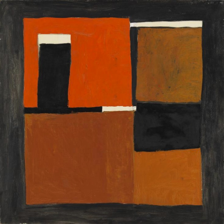
William Scott, Orange, Black and White Composition, 1953 (oil on canvas)

OBW_Scott

Bit of both, really. See I’m no art expert, have no training in the field and know little more than the next man or woman. But I use my eyes and I like to look. So what do my eyes tell me about William Scott’s Orange, Black and White Composition which hangs in the Tate Britain gallery in Pimlico? Well, loads. Firstly there are no squiggles, it’s all straight lines, all geometric but in a haphazard way: the square angles are not perfect 90 degrees and the lines are not drawn with a ruler. As there is nothing curved, nothing circular, the initial impression is one of hardness rather than softness.

And what about the restricted palette, just three colours? What does the lack of bright colours, the lack of pastels, for example, what does that tell us? In fact the colours are all muddy, earthy, iron and coal sort of colours.

Do we have to like a painting in order to appreciate it? I think not. We can find it interesting; we can enter into a dialogue with it, but not necessarily find it beautiful. However, it may tell us more about ourselves than we imagine if we look hard enough, and its beauty may slowly emerge. If we dismiss it out of hand that may be our loss. First of all the painting is a product and represents the cumulative effect of many decisions, many thought processes and yes, many emotions. It’s too easy to say, “Don’t like it,” when it hangs in a gallery crowded with other paintings that on the surface are far more attractive.

Whenever we see a frame we peer into its contents as though it were a window or mirror. Not all mirrors have shiny silvery surfaces. Hamlet, for example, holds a mirror up to his soul when he asks the old chestnut, and we call that a soliloquy, but in the plastic arts, paintings are soliloquies too! It’s all questions, questions, questions, and sometimes, but rarely. . . answers. Art is consciousness directed into an expressive form, shape, contour; it is a process of inclusion and exclusion, of affirmation, and a rejection of denial. Scott’s composition is essentially a frame with a view and with no view, a view of no view; it is opaque, there’s nothing to see, except perhaps what we see within ourselves as we observe it. Nothing really representational. It is abstract but the shapes are real and familiar. Personally, I find the painting endearing, the textures and the planes are an invitation that draws me in, perhaps to an inner landscape: hardness gives way to softness, and the simplicity with which he handles three colours is, to me, a virtuoso performance. So there!

Said enough? On your bike, sonny Jim? Stick to what you supposedly know? Blaggard?


scott_portraitWilliam Scott (1913-1989) one of seven children, was born in the Scottish port of Greenock. In her brief study of Scott’s art, Sarah Whitfield writes: ‘His parents lived in a small flat at the top of the tall granite tenement near the quay. And it was there he spent his early childhood. He never forgot the grim aspect of those impoverished surroundings. Scott himself wrote: “There were lots of bridges and tunnels, stations and steps, stone bridges you went over and iron bridges you went under – bits of ground between streets that had never been built on growing nettles.”’ When he was eleven years old the family moved to Enniskillen in Co. Fermanagh, by the banks of Lough Erne.

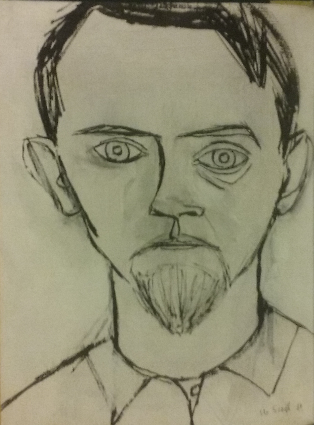
In the mid 1950s, Scott (pictured right in his self-portrait) criticized hard-edged abstract art as ‘too smartly done, too beautifully done, too tasteful, too perfect. . . so well done one loses a sense of humanity about it.’ He also spoke of his belief in ‘the beauty of things badly done’. Whitfield again: ‘His disregard for perfection also allowed him to stay nearer to the messy vitality of life, to keep hold of the struggle and tension that had gone into the making of a composition.’